Fields Say So Much: Improving a University Application
by Ardis Kadiu · Updated Apr 21, 2021
Usability testing leads the way towards a better college application.
Conducting usability tests is a lot like watching a family member or friend struggle with a website you use regularly.
You think “The ‘add to cart’ button is right there. How are they missing it?”
But in a usability test, you can’t offer a helping hand. Instead, it’s your job to observe and understand why something is hard to find or difficult to do and fix it.
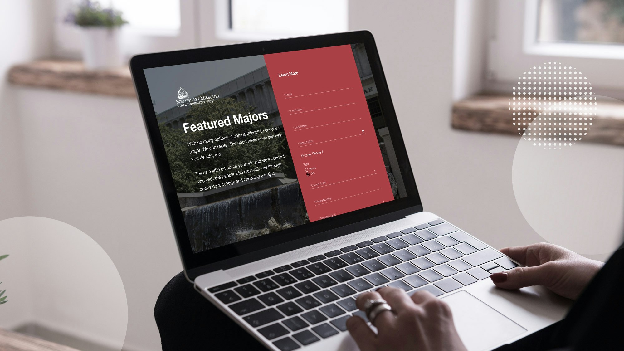
Last fall we held a series of usability tests on the application module of Element451, a platform built by Spark451 for colleges and universities to recruit students. The application module, called App451, enables colleges to build responsive online applications to apply to their school.
Our goal was to collect information for a software update that would improve aspects of App451’s user experience and technical performance.
While the testing yielded what we had hoped to hear from users — many remarked that the application was “simple” to use, for example — it revealed design and functionality that could be better.
Usability Testing Setup
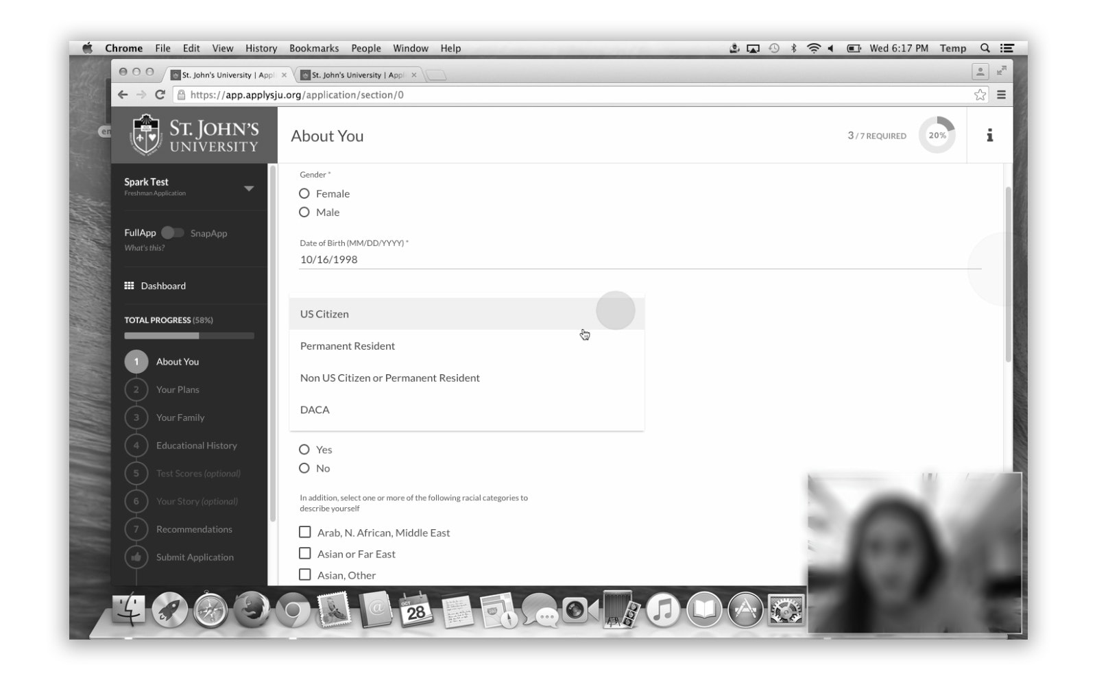
We enlisted twelve high school students (juniors, seniors and a couple of sophomores) to participate in the usability tests. Each was asked to use a laptop we provided in our office to complete a college application created with App451.
Roughly half of the participants completed what is called the SnapApp, a version of the application that displays only required fields. The others completed the full application.
As they worked through the application, we recorded each participant’s screen and their face using a program for capturing usability tests.
Participants answered a two-question survey after completing the application: “What was your overall impression of using the application” and “Were there any areas that you had problems with or were confusing?”
What We Were Looking For + Review Process
App451 is similar to a CMS in that it gives schools the elements they need to customize a step-based application using their application content. The elements include standard form items such as grouped fields for things like home address. It also includes form elements specific to what colleges ask applicants, such as which high school they graduated or will graduate from.
After the usability tests were complete, we uploaded the videos and surveys to a shared space where our product team could access them. Our UX/UI designers and UX writer got together to document in a Google doc where users got stuck.
Because colleges determine the content of their application, we were primarily looking for functional and design issues. The phrasing of a question such as “Where did your parent earn their college degree,” for example, wasn’t our purview, but default help text or error messages were.


Findings + Fixes
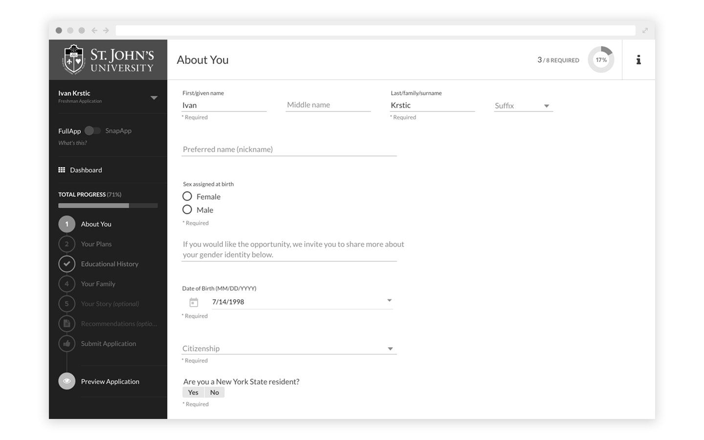
Testing showed several issues that a majority of participants ran into. One was date-of-birth. The DOB field was configured to accept the date in a month/day/year format. Help text of MM/DD/YYYY guided the user. Or so we thought.
Many usability testers had difficulty entering their date of birth. If their birth month was a single digit, it took a few attempts until they entered “0” before the month, e.g. “02 for February” instead of “2.”
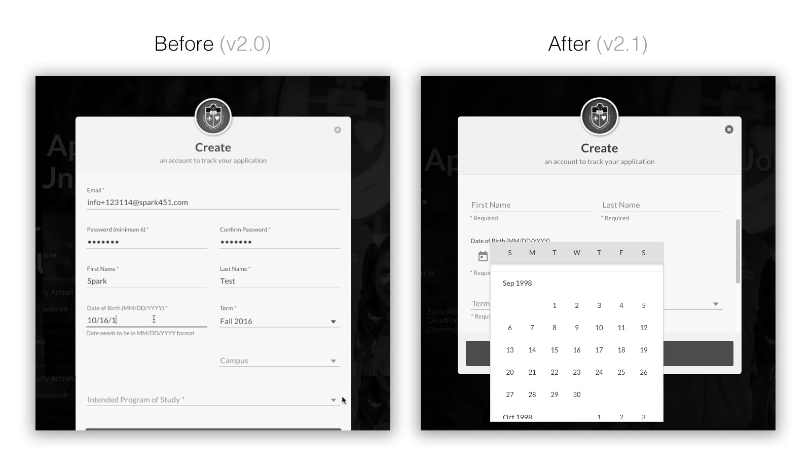
That field was a special case. As much as possible we use Google Material’s styleguide, and that field did not follow Material’s date picker design. So even before testing, we knew we wanted to address the DOB field.
Our solution was to change the field to the Material date picker. However, because we didn’t want users to have to click back month-by-month to get to their birth year, we defaulted the year to 18 years in the past, when most high school applicants were born. If a school were to use App451 for applications to its master’s programs, the default year could be changed.
Another common issue was that users appeared to not know how to begin filling out their application after the create account step brought them to the front screen of the application.
The screen showed a prominent “continue application” button, but it wasn’t prompting quick action. While “continue application” is technically correct because data entered in account creation counts towards application completion, the term didn’t match what users wanted to do next. We decided that “start application” would be more intuitive.
An area of the application that required deeper UX and development work involved what’s called a CEEB code. The College Entrance Examination Board assigns a code to high schools and colleges to make sure the correct institution is being referenced in applications and materials like transcripts and test scores. Most college applications include a section for applicants to enter information about their high school and provides a CEEB search to populate the CEEB code field.
Because not every applicant will be or will have graduated from a high school — they might be homeschooled or earned a GED — the high school section needs to accommodate many possibilities. To do so requires additional fields and conditional logic. Applicants may have also attended multiple high schools, so there needs to be a way to add records for more than one high school.
Our usability tests revealed that the relative complexity on the back-end to allow for everything the application might need to collect was translating to confusion on the front end.
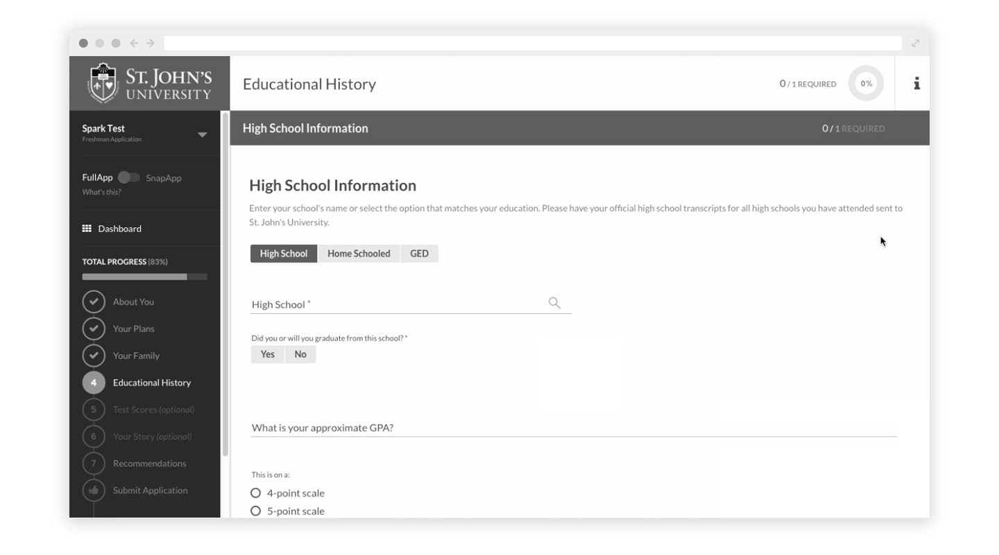
One thing we found in multiple tests is that users were skipping over the high school search field needed to add the CEEB code. They were filling in all the other fields in the section, but when they clicked “add school” they would receive an error message.
To resolve the issue, we added a search icon next to the CEEB lookup field to provide a cue that they needed to enter their high school’s name and select it from the results. We also added a message that appears until the school is searched for and selected.
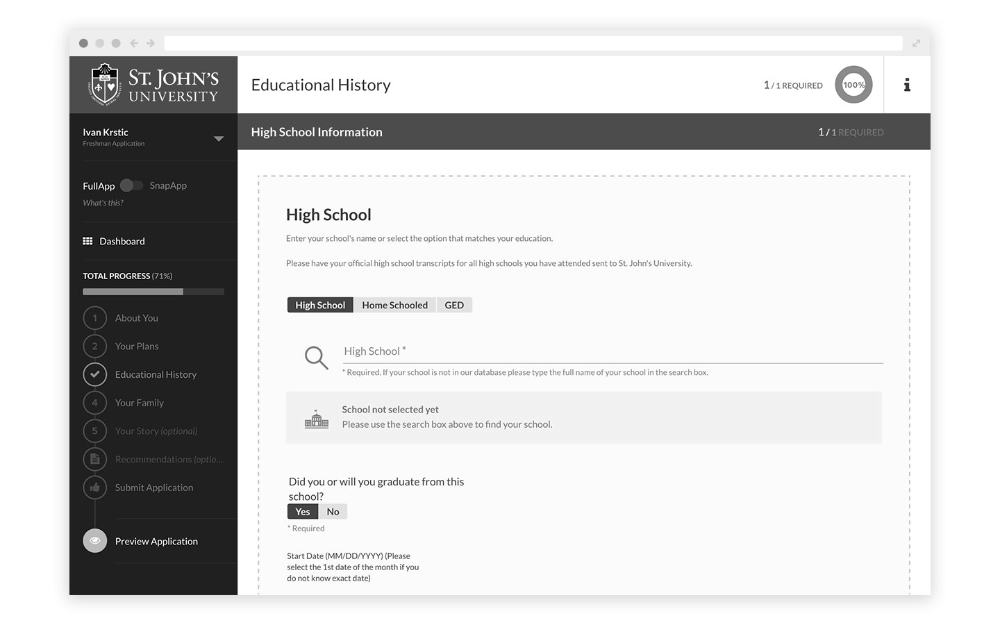
We also noticed that help text that read “Not your school?” that was intended to let applicants know they could search again or manually type in their school’s name was being interpreted not as a question, but as an error message. That was in part because the style for hyperlinks was determined by the school’s colors, and this particular school’s color happened to be red, the conventional color for error messages. It’s also possible that the question mark, which typically helps to convey a conversational tone, might have miscommunicated the message. We left out the mark on the updated version and use it carefully in other help text.
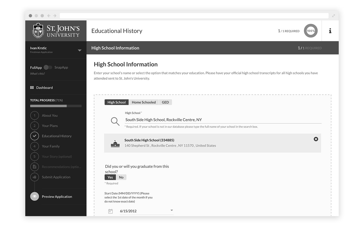
Testing also led to an additional UI enhancement to help applicants know that the information they’re entering is for one school, and applies to just that school. We incorporated a dashed line around the area for entering high school information. If the applicant enters another school record, the dashed line is visible only for the school’s information they are editing.
From Testing to Implementation
After our UX team explored approaches to solving the issues the usability tests uncovered, the UX/UI designers created designs and our UX writer provided microcopy.
From there, we brought in our development team to implement the changes during several sprints. We rolled out the significantly updated App451 in early summer.
Always Be Testing, Always Be Learning
What’s great about doing usability tests is that it informs not just what you’re testing, but the features and functionality you’ll design next.
As we continue to improve App451 and build out more modules for Element451, our team will be thinking of the lessons learned in these usability tests and the ways we improved the user experience.

About Element451
Boost enrollment, improve engagement, and support students with an AI-driven CRM and agent platform built for higher ed. Element451 makes personalization scalable and success repeatable.
Categories
New Blog Posts

The Definitive Guide
AI in Higher Education
Bridge the gap between the latest tech advancements and your institution's success.
Useful Links

Talk With Us
Element451 is an AI-driven CRM and AI agent platform for higher education. Our friendly experts are here to help you explore how Element451 can improve outcomes for your school and students.
Get a Demo


